"I
DUNNO, I'M MAKIN' IT UP AS I GO..."
 By
looking at this page, you can probably guess I'm a big Indiana Jones
nerd... Well, so be it. RAIDERS OF THE LOST ARK was a great
source of inspiration for me, and two of the artists who did the
film's art campaign -- Drew Struzan and the late, great Richard
Amsel -- I've aspired to emulate. (Struzan is widely reknown
for his work on the Indiana Jones, Star Wars, and Back to the Future
series, while Amsel did the campaigns for THE STING, FLASH GORDON,
THE CHAMP, THE SHOOTIST, MURDER ON THE ORIENT EXPRESS, THE DARK
CRYSTAL, MAD MAX III, and countless TV
Guide covers.) As for me, I'm still working on it, though I
think I'm improving. By
looking at this page, you can probably guess I'm a big Indiana Jones
nerd... Well, so be it. RAIDERS OF THE LOST ARK was a great
source of inspiration for me, and two of the artists who did the
film's art campaign -- Drew Struzan and the late, great Richard
Amsel -- I've aspired to emulate. (Struzan is widely reknown
for his work on the Indiana Jones, Star Wars, and Back to the Future
series, while Amsel did the campaigns for THE STING, FLASH GORDON,
THE CHAMP, THE SHOOTIST, MURDER ON THE ORIENT EXPRESS, THE DARK
CRYSTAL, MAD MAX III, and countless TV
Guide covers.) As for me, I'm still working on it, though I
think I'm improving.
 For
this INDIANA JONES illustration, I'll coin the punchline
Harrison Ford used so well: "I don't know, I'm making
it up as I go..." That was a literal truth with this
painting, made over the course of about three years. I
wanted to feature a "poster" design similiar
to that of Drew Struzan's work, but with closeups of the
lead characters and a surrounding montage of events from
the movie. I sorted through a variety of stills, selecting
the two portraits of Harrison Ford and Karen Allen that
I thought would be perfect...That is, until I decided
to change my mind. For
this INDIANA JONES illustration, I'll coin the punchline
Harrison Ford used so well: "I don't know, I'm making
it up as I go..." That was a literal truth with this
painting, made over the course of about three years. I
wanted to feature a "poster" design similiar
to that of Drew Struzan's work, but with closeups of the
lead characters and a surrounding montage of events from
the movie. I sorted through a variety of stills, selecting
the two portraits of Harrison Ford and Karen Allen that
I thought would be perfect...That is, until I decided
to change my mind.
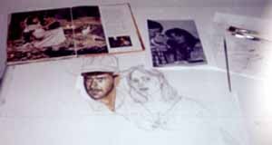
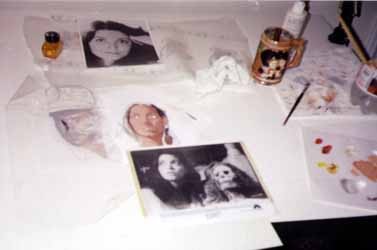
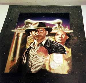
 Here
you can see the original sketch of what I had planned
Indy & Marion to look like. Let me say here that
every good artist should take their time, plan carefully,
and try to have as thorough a sketch of the ENTIRE design
as possible... But I'm not that good an artist. I instead
insisted on doing the closeup portraits FIRST, under
the impression that everything would go great as I went
along. Oh well. For Marion, I sketched out and started
to paint an alternate pose, but realized early on that
I didn't like it, and I opted for another photo reference. Here
you can see the original sketch of what I had planned
Indy & Marion to look like. Let me say here that
every good artist should take their time, plan carefully,
and try to have as thorough a sketch of the ENTIRE design
as possible... But I'm not that good an artist. I instead
insisted on doing the closeup portraits FIRST, under
the impression that everything would go great as I went
along. Oh well. For Marion, I sketched out and started
to paint an alternate pose, but realized early on that
I didn't like it, and I opted for another photo reference.
You
can also see the early preparations for Marion as she
appeared in the final painting. I covered the earlier
painting with gesso, sketched in the new face, and placed
over a basic coat of acrylic color. From there, I refine
the portrait with more paint as well as colored pencil,
layer after layer. (At this point, I was still set on
using the old pose of Indy as shown...)
 A
quite paintful process: covering all the work I had done
on Indy's mug with a layer of gesso. The gesso was sanded,
and the new pose was sketched in. Yet while I liked it
much more, it caused another dilemma: it conflicted with
the smaller "montage" characters and scenes
on the bottom. They, too, therefore needed to be re-done. A
quite paintful process: covering all the work I had done
on Indy's mug with a layer of gesso. The gesso was sanded,
and the new pose was sketched in. Yet while I liked it
much more, it caused another dilemma: it conflicted with
the smaller "montage" characters and scenes
on the bottom. They, too, therefore needed to be re-done.
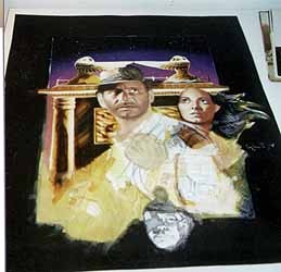
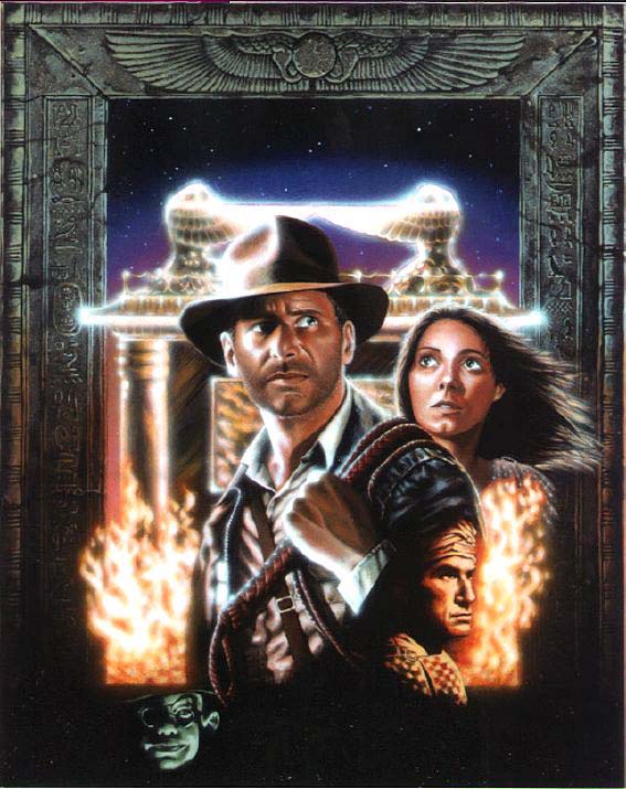
And
now the work began to take its completed form. A black border
was painted around the characters, as I wanted to incorporate
an ancient-Egyptian style "frame".
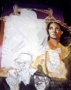
The
background sky was airbrushed in. For the smaller montage
of characters, you can see that the original idea here,
too, differed from the final product: Belloq is in a different
pose, Toht has the same pose but is in a different position,
and there was the inclusion of an image from the truck
chase.
 The
"Ark" in the background was loosely brushed
in, so I could have an idea as to how the color balance
would look in relation to the characters. But at this
point, halfway into the painting, I admitted to myself
how much I hated Indy's pose. I tried to revise it over
and over, but realized that the only way to get it right
was to start over, from scratch. The
"Ark" in the background was loosely brushed
in, so I could have an idea as to how the color balance
would look in relation to the characters. But at this
point, halfway into the painting, I admitted to myself
how much I hated Indy's pose. I tried to revise it over
and over, but realized that the only way to get it right
was to start over, from scratch.
 I
really wanted to keep the truck chase image, but it proved
problematic in relation to Indy's jacket. I started out
on the border "frame" by using a toothbrush
to "flick" on specs of color for implying stonework.
I had also originally planned to include montage elements
on the TOP part of the frame (including a transparent
plane flying over the "red line/world map"),
but as the border design became more and more detailed,
I decided not to overdo it. I
really wanted to keep the truck chase image, but it proved
problematic in relation to Indy's jacket. I started out
on the border "frame" by using a toothbrush
to "flick" on specs of color for implying stonework.
I had also originally planned to include montage elements
on the TOP part of the frame (including a transparent
plane flying over the "red line/world map"),
but as the border design became more and more detailed,
I decided not to overdo it.
Easily
the hardest part of the painting for me was the Ark. I
spent a good month on it. Getting the lighting and color
right prior to airbrushing drove me half mad.
  The
fire was NOT my original idea, either -- it was too similiar
to what Struzan did -- but I felt that it would be the
best way to "marry" the montage elements together. The
fire was NOT my original idea, either -- it was too similiar
to what Struzan did -- but I felt that it would be the
best way to "marry" the montage elements together.
I
also wanted to inject more color -- reds and yellows.
This also required my adding red and yellow highlights
to the "stone carvings" on the frame for a 3-D
effect. (One person saw the image on the internet asked
me, "Where did you buy the frame?" So I guess
it turned out alright.)
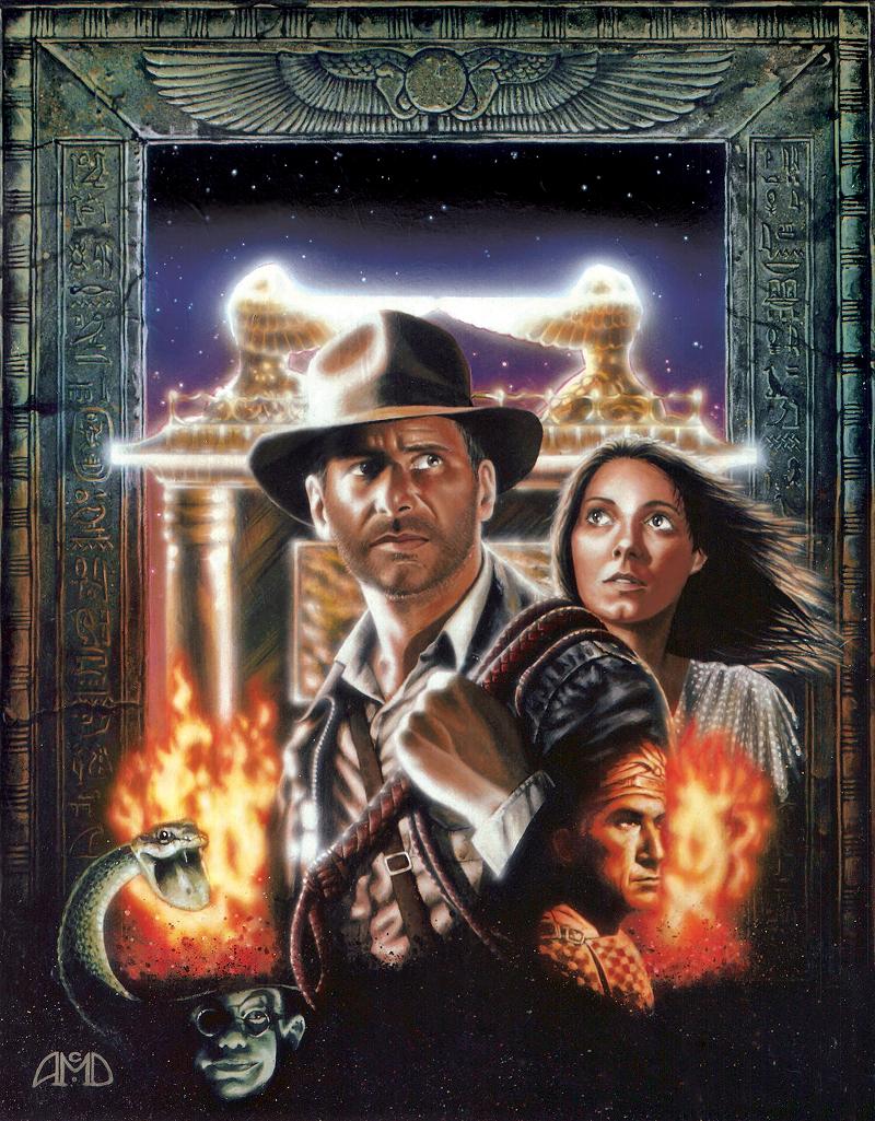
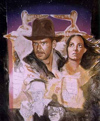
The
finished painting.

|